NetBase Quid Logo Redesign
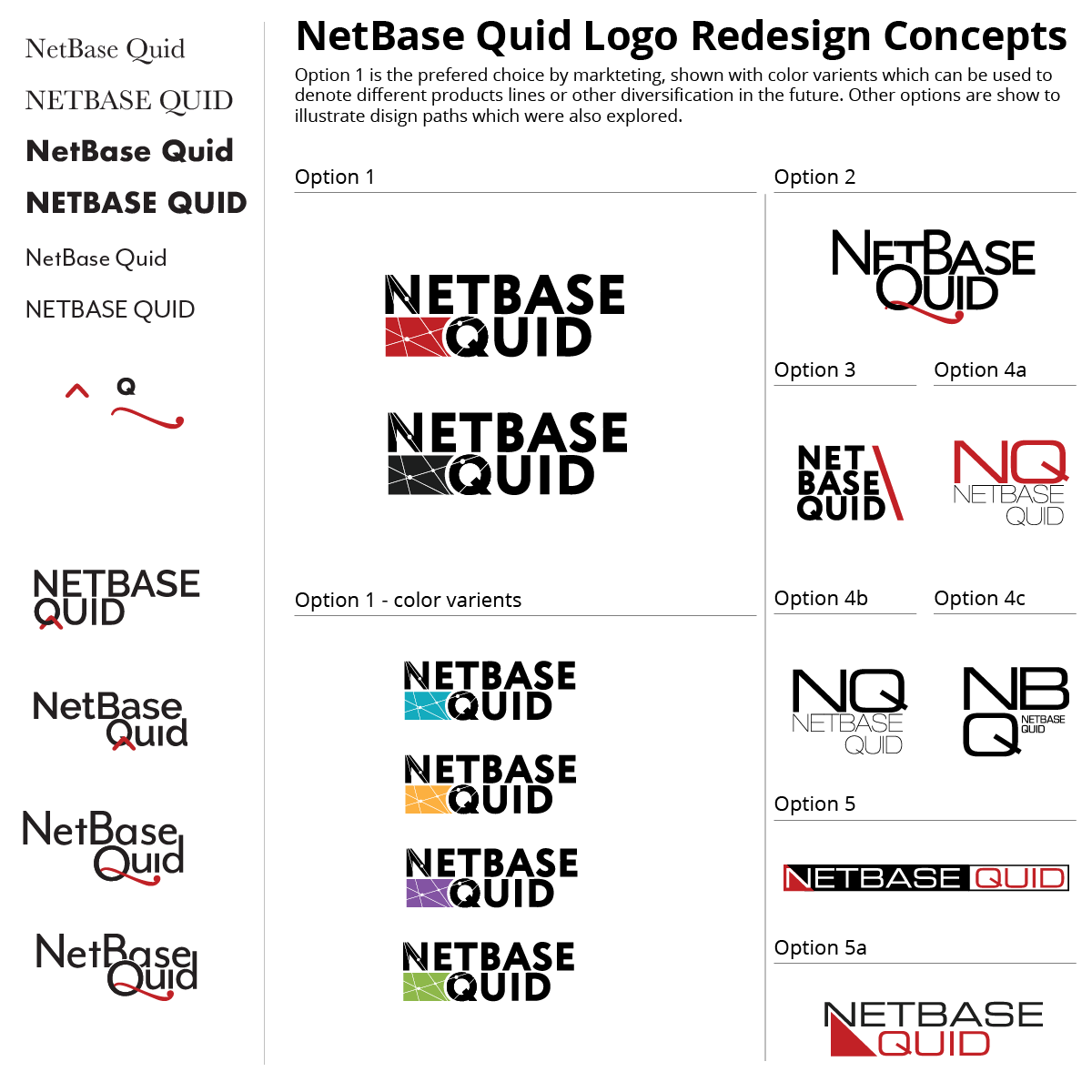
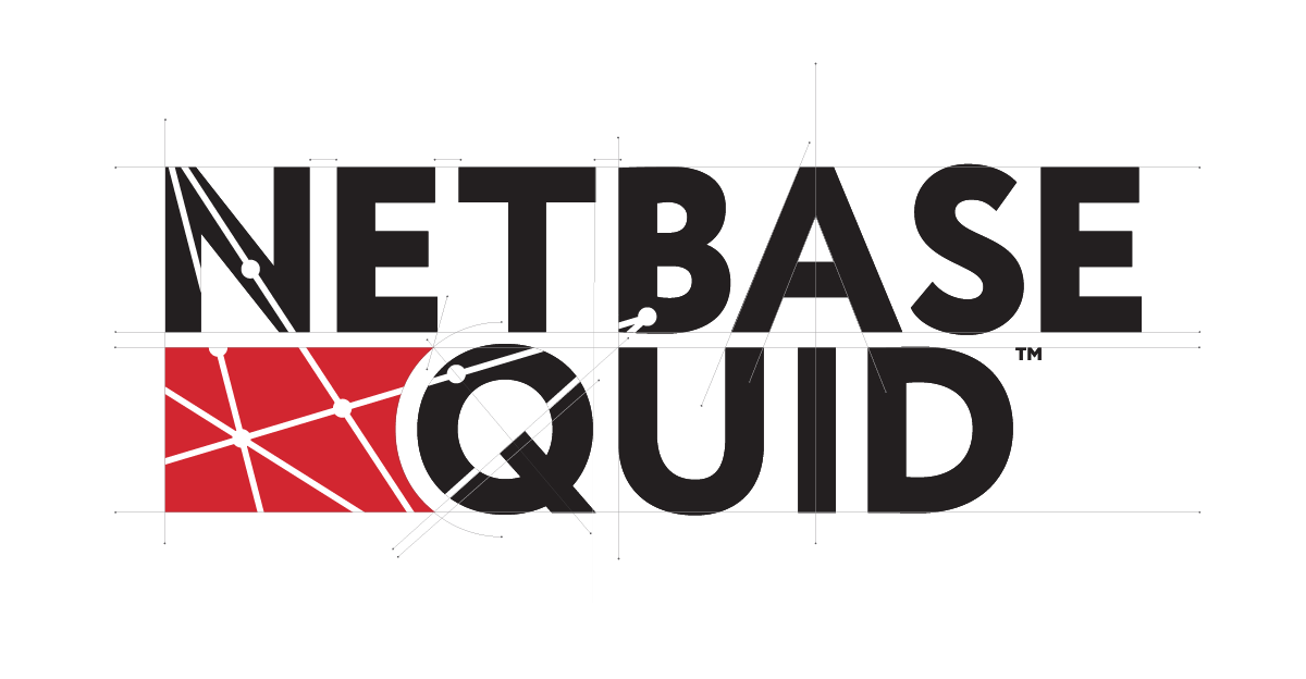
In 2019 NetBase Solution, inc. acquired Quid, Inc.; although this was an acquisition, NetBase wanted to present this as a merger of complementary technologies and change the company name to NetBase Quid®. The new logo I created combined NetBase name with the Quid name while balancing the visual weight between the two brands, and incorporating a graphical element of network nodes and lines to represent the shared data that now flowed between the two products. Three nodes were each placed in the respective letter forms of the primary consonants N, B and Q, visually tying the two brands together.
Tools
Illustrator

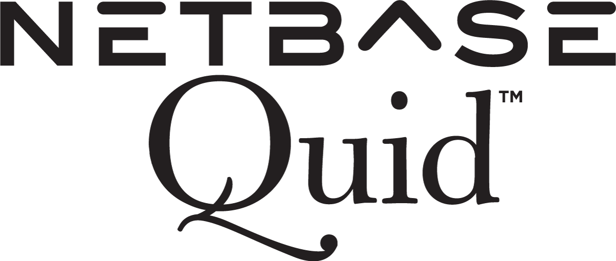
Two Unique Brands
Although the technologies of the two companies were complementary, the two brands were polar opposites. NetBase relied on warm grays and red combined with futuristic, sans-serif typography with soft rounded edges and even line weights. Quid, on the other hand, featured cool black, gray and teal colors used in combination serif fonts with high-contrast lines and a flourished Q.
Stacked Together
The merger of the companies happened quickly and without a branding plan for the new company name. At senior management’s request, the new brand’s first iteration was to stack the two logos together. My challenge was finding a way to do this that felt balanced and gave equal weight to each of the brands.
Logo Iterations
I began this process by evaluating the letter forms of the two brand names in serif and sans-serif fonts, how the letter forms interacted and if there were legacy elements of the brands that could be retained. The crossbar of the Q was an early focus of the iterations; as were the company’s initials. These explorations informed the choices later to use a geometric typeface with a strong crossbar on the Q and anchor the NBQ letters with the network nodes.
Refined
Once this direction had been agreed upon, it was time to start to modify the letter forms, kerning, letter spacing and alignment. The third node of the network was added to anchor in the B.
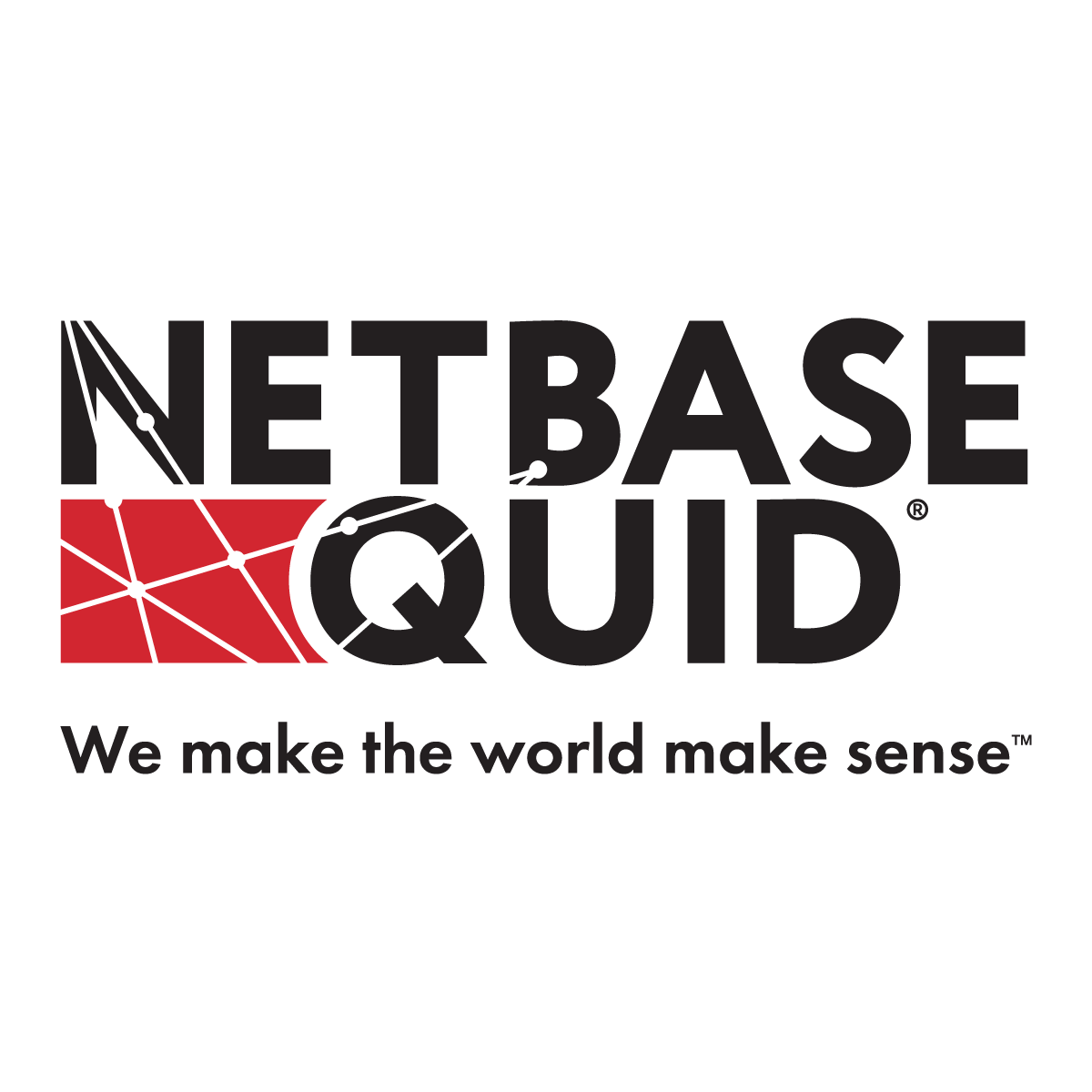
Eventually, a tagline was added and the new logo was registered with the USPO, the final logo included the ®.

